Saturday 29 January 2011

music survey


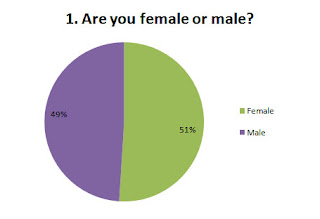
51% of respondents who answered my questionnaire were male. However 44% of the audience  respond to my questionnaire were female. But in my previous project the percentage of both genders has changed. Both genders are not represented fairly as there are more male than females respondents. Also the result shows a bias veiw as it is not 100% reliable.


This result has shown me the main audience could  young adult  as 80% of the respondent were over 18.
 This question is useful because it would allow me to identify the type music  that are now commonly listened to by the young generation.  Also this would help me  find out the USP that would market my music magazine.  There is a even percentage of 34% each for R&B and Bashment music. Hip hop is second popular with 30% listern to it. Also only 2% of the respondent listen to country music. Overall the  rates shows the ethic of respondent. Example, Basement is known as fast Jamaican music  which normally to black people.
 However this judgement is not 100% reliable as it is doesn’t show...
I may not take this question as consideration because I want to create a music that has mixture of music genre .
 This is question is very important because it is the main purpose of my research to find out whether the general  public are interested about music. Although 93% of respondents read music magazines.
Hopefully the other questions will give me a clearer idea of more information as this question doesn't tell me how frequent people read a music magazine.  
 I selected three major music magazine  as they are a threat to my magazine.  The result showed that 40% of the respondents find  magazine brand unimportant. The majority of the respondents - 30% have an interest in Rolling Stone, Vibe was found to be least interesting. Looking at the result, I may use similiar features to the popular magazine, Rolling Stone.    


 Based on the result, I have consider gossip feaures such as embrassing images and secondary sources would accpectable for audience as it is the highest percentage of 33%. Runner up is to analyse music event in theme of interveiws with upcoming artist. Using this feature would introduce their career and also promote my magazine.


I found this question relative because  my pervious of experience  of development wasn’t successful as I had lack of  information and timing. The question shows that 41% of the respondents found that models are their main attraction. Also 39%  find the design layout very attractive to buy a magazine. This result would help spend more time on a feature that is persuasive and also it help me on the development planning . I will careful select the right model that represents my audience and their custume would have a diverse look to make my magazine appealing.  

This question would help me decide whether I want my magazine to target at a niche audience. It would also help me find about more of the respondents.  This shows  that 24% of the respondents are black-British in origin. Due black popluartion being the greatest pencentage of the question, I probaly target my magazine towards the black ethic group, however I will include ethic groug, such White British 22%.


The cost of product is very important because you need to know the audience wealth fare and also the prize can be competitive in-between other magazine, such as Vibe. So the question shows that 38% of respondents can buy a magazine in the minimum prize of £ 1.05 to £ 2. Although 33% can purchase a music magazine, less than 0 to £1.00. This shows that rescission has an affect on prizing as most magazine would have to the  price as way satiafcate the audience and that would make the company have no profit.  So I may decided.....


 The results releaves that 75% of respondents does not take notice while reading a magazine. Although 25% agreed to the question, it is an eye opener to me as the designer. I would make sure that that my content page contain features that  are creative and appealing to the main audience.


 Although I have made a decision on my target audience, I will asked particular question to find out their personal opinion on audience. The question shows that 32% of respondent  would  like the magazine to target young people. But 32% would prefer music magazine to main at adult.  Looking at the result, I have decided to aim my music magazine at the young audience.(17 to 24)
 This is an question which relate to the audience opinion on audience.
41% of the respondents wants the magazine to be target on both gender  as 59% disagree and wants the main attention to be in separate  gender (male and female). So I may decide to have both genders to be part of my target audience 


introduction

Introduction
I am A-level student that is studying media studies in a sixth from college called Christ Of King. I have previously finished a stage of my project and I did college magazine of front cover and content page. Doing this, I have decided to expand my latest skill and knowledge at my final stage of creating a music magazine. Throughout my progress of the college magazine, I have learnt how research  is important because it would help you break out the ideas easily by knowing the positive and negative and also it can help by collecting their views then transform it through your final piece. So I would use the social network collect information from primary research and this mainly by giving question to people at facebook (   ). Also through the questionnaire, I would be able to do survey presentation of my target audience views on music and magazine. It is useful web because it is non private site that anyone can use to transport information to any issues and also it is the latest research in modern society.....
 In the music magazine, I would have to feature a front cover, content page and double spread.  It requires key information to produce a music magazine. So I decided to analyse existing magazine that has a similar idea and audience to my own magazine. Also it would allow me have detail information on the front cover and double page spread of music magazine.  ....... Although I am working on a new project, I will develop new experience to achieve a double spread of my music magazine. For the moment, I don’t have any kind of knowledge of creating this certain aspect for magazine, but I would do extra recourses to gain me through my progress of final stage. In spite of this, I may use oringal magazine pages to help me know how certain feature can give the possibility of creating attraction. Also I would be taken would be in much detail so I would using a case studying of a Publishing Housing.
 Alternatively, I will move unto the development stage of taking non-manipulated photos for the three feature of my music photo (front cover, content page and double spread). At that point, I would ready though of a particular location/event and main theme of the photo that would translate a story through the various photographs. But at this cirstims, I would unable to feature an celebrity due to the lack of funding.  After choosing the images, I would plan out a prototype of my music magazine and this is by drafting an minimum of five examples that would show the page layouts of the front cover, content and double spread pages. This would help me create my own final design on Photoshop and be an opportunity to take down my previous experience and put it to action. To finally complete the stages, I would to do final evaluation to express and describe the overall presentation of my music magazine. 
As I am making my own music magazine, the music genre would be R& B, hip hop and the appropriate audience for this particular genre is 19 to 25 years old that is based on both gender. I would have to make sure that these key things would come across on my magazine and this is by choosing the right music artist to represent the main audience, using type of design feature to show the age group and include cover lines to be suitable for both genders. At this particular music genre that I have chosen, it is normally shown that an existing music artist should be featured or shown on a front cover of music magazine. But as I don’t have the requirement of having celebrity model, I may create my own existing signer or go to music events and takes several of photo images for my primary research......
 I wanted to aim my music magazine to young people because they are the generation of creating new music that is inspiring to the public eye. Example, ‘N-Burz’ is three young members that are aged between same as my target audience. They have created street rap music that involves R&B, Rock and other genre to be appeal to any age, nationality, ethics and gender. Also most music magazine is normally based for male adult as the uses of customs on female artist are attractive and kind of sex appealing to men. Example: Rolling stone feature Christian Angelina wore a sailor custom which gives a fantasy feeling on men minds.  
Hopefully, I would complete the development of creating my own magazine and learn and gain experiences that my help me on the next project at media studies. Also the final stage of finish the magazine project would help me see how certain features are appropriate for campaign of promotion and the key stages of production. 

Thursday 27 January 2011

questionnaire


music textual analysis

music textual analysis

Textual Analysis of Music Magazine of Rolling stone- 800 words
Masthead
The Masthead is mostly covered by the size of the photography which empowers Amy Warehouse’s status and the denotation to the body language connotes the unimportance of the main title, ‘Rolling Stone’. Also this unusual change was purposefully done to create a statement to the audience and continues a trend that they use to empower the celebrity status. In addition, ‘Rolling stone’ is universal title which is well known to public eye so main image can cover most of the masthead.   The master head uses a Serif front, the first letter of each word is not joined but the rest of lower case letter are joined together, and this connotes old fashion tradition. The Rolling stone Masthead has a distractive look: blue with white lining and a black backdrop. The magazine cover has masculine colours (black, red and light blue) to portray their target audience and these are British men, aged between 25 and 40. Also the masthead has rock n roll theme that is historically dominated by a male audience. Although featuring a female celebrity can change the perspective to a female position, the magazine still appeal to mostly male audience. 
Main image 
The magazine cover features a colour photograph of a female music celebrity, ‘Amy Winehouse’ directly looking upwards to face the audience eye to eye. Also it is a medium close up shot with a steady camera angle. As the magazine is music based, her tattoo represent the independence of her music career and also the image of females on her arms shows she find them inspirational because there are independent and provocative women who made big choices to be their own individual.
Costume:
The model, Amy Wine house wears a low-cut black vest as the main costume; her blue bra strap is also visible. Her pose imitates the tattoo image being suggestive and alluring. Even though the costume wasn’t carefully picked her cleavage is clearly shown and its look sexually appealing to the male target audience. Amy’s costume shows how the magazine, ‘Rolling Stone’ kept their tradition of using female celebrities to be their attraction for the male audience. Amy has a 60’s beehive hairstyle which full up most of the front cover and her simple make up is shows her usual characteristic style, example, the black eye liner flicks backwards from her eye lid.
Lighting:
On Amy’s face, the high key lighting complements the air brush effects by creating a smooth and healthy skin tone on her face making it look believable but can be contradicted with paparazzi shots of her without make up.  Also the glowing skin tone may be designed to introduce Amy as a new person that is ready to reveal her secret past.
NVC:
The camera angle directly focus on the male traits (tattoo) to convie..... However her facial expression define the demure gaze that can mislead the audience by  head position . Also the tattoo sigifnal her interest of the 1960’s tattoo style and that shows her independane and also her feminine side though the non verbal communication.  Also the chosen the model relates to the title because.... body pouser shows lanziness. Also the model represents the target audience because...... The pose …..
Setting:
Main Coverlines                                  
The magazine cover has three separate cover line that has completely different propose. The main cover line, ‘The diva and her demons’ gives an summary towards Amy Winehouse life. Also the main cover line refers to her successful career as ‘The diva’ but she is mostly known by her history of drug alcohol and bad relationship and this is known as ‘her demons’. The main image making statememnt by revealing her hiddern sercect to the plubic also adverting  herself by showing new person.......... All of the cover line use a serif front, connoting tradition also the short quotation is coloured in red which connote danger, evil and blood. This have relate to Amy Warehouse’s history has several records of asscult.......
The magazine features Amy Warehouse to be their front cover, she is know by her famous music, ‘rehad’ but she is mostly attracted by her past of drug addiction and court cases. The cover line, ‘’the diva and her demons’ summarys her life as it shows and secret revaletion towards the audience.  Also the cover line is
Coverline
. ‘’Summer tours’ has link to the adult life of the target audience. .........
Target Audience:
SIR THIS IS THE FRIST DRAFT OF TEXTUAL ANAYLSIS- MY SUPPORT TEACHEAR NEARLY COMPLETING THE CROORECTION/TARGET OF 800 WORDS

Wednesday 26 January 2011

evualtion

Final Evaluation
Through out of couple of days, I did secondary and primary research to create a new college magazine, which would appeal to both genders for further education students; aged between 16 and 19.  Firstly I looked at an existing advert and college magazine to find some inspiration. Doing this, I looked at their ideas and did my vision of a front cover and content page. But due to the limited timing, I was unable to meet my target audience’s needs and demands. However I have finally completed my project and I would use this example to evaluate the progress of my personal knowledge and skills. Also I would use the experience to expand my creative ability for my next project.
For my college magazine, I decided to title my font cover, ‘your future’ because it would question my audience’s day to day life and get them to stop and think about their future. So I used sans serif font to connote a modern look and added special features, such as shadowing, to recreate a new design on the original front which makes the layout look realistic.  These effects would me give the opportunity to encourage new customers to buy the college magazine.  Unfortunately I ignored my audience’s request of adding more colours on my front cover and instead I used plain, simple black/white colours to compliment the main photography. I also wanted to create a type of diversion between the fonts so I changed the font size, format, and the style; which showed the importance of certain words. 
For my content page, I used a similar font to create a continuous vibe from the beginning to the end. But due to the lack of information, I have a variety of ideas to produce for my final design. However I able to design a double spread landscape close up photo setting of my college King and added special feature to produce a cloudy effect on the sky. I decide to use that this particular image as a main layer because it reinforces a feeling of welcome and happiness because it helps students to visualise themselves in further education. The light green of the trees connotes newness and change; how the students can grow as a person for their future. The photo contains a new and improved building to show how the college itself changes throughout the year.   Even though, I wanted to create a college magazine that has entertained my target audience, I also wanted....... On the other hand, the overall presentation of the content page has standard look and this can be a downfall my lack of performance because it contains basic features that makes it look plain and simple.

I have created a college magazine called ‘Your future’; I decided to use this title because it challenges my audience and also it can be inspirational for CTK students.  During my progress, I had difficult of selecting the right photo for my front cover because most of the images weren’t medium shot and the angle was birds eye view. So I took single medium close up of a female student, I find the image suitable because she represents my target audience by having positive look. Sadly I was enabling to complete most of my conventions because I had no experience of using Photoshop and also I had limited time to meet the deadline. 
Even though I haven’t completed the needs, I pleased that I have met my respondent s requirements on the style of font. I decided to use bold and simple colours on the front and featured it on my cover lines but I change the sizes and design to see the separation between the main cover line and other features.
Unlikely other magazines, it contains negative views of the young audience and that creates a stereotypical image to the general pulbic. So to involve things, I decided to use a Ctk sudent to help my target audience think positively about their future. However the master head also invnole into the positive message as it....(political view). This shown through the model’s NVC (The non-verbal communication) by the reflecting of their reaction to the college and the facial expression connotes happiness and success. I wanted to make my magazine look original so I decided to use a simple, minimal style; for the costume I have chosen black jacket, blue hoodie and plain black top. I didn’t want the college magazine to look stereotypical because stereotypes can be offensive to the audience for example, if the student in the photo was wearing fashionable clothing, it could undermine the college’s image; readers may think the college is upper class.
 Looking back to my research, the example of a college front cover has shown me the common way of magazine using a studio to produce an artificial background and image shots. So I added a wide angle shot showing a sport gym and expand the image size to suit the model position. But the lighting is a way of separating the two images as the model have key light which shown through the skin tone and the main layer is low key by dull, dark colour of the image. I really like how the backdrop relates to the winter issue of the magazine and the cover line has link to the front cover image.              Example: ‘true story winter disaster’ is a catchy fresa that is titled upon the new flash....... and the cover line shows how the model is revealing her inspiration through the tragic experience that may be an positive action to her future.
My analysis has shown me that most existing college magazine is more educational and has lack of interest of student needs. This evidently shown that the magazine has a good way of persuading secondary leaver parents to attend their college and this is through my primary source, my questionnaire as ....... Also college magazine are targeted to adult as they uses magazine to adverts their college to tell important information and satatics to their college magazine. This shown through the cover line, as it contain formal voloentable  that are presented with bold, simple fronts in a simple layout. So as my primary research, it has shown me that student mostly read gossip magazine, I decide to use catchy and short words on my cover lines to the stories reality base.....
Overall, I am really happy with my presentation of my contents page and my front cover. But if had an opportunity I would change the layout of the contents page because it looks too simple and also the lack of timing to do the work compare to my front cover. I would change the layout structure of the front cover so that it would more realistic and persuasive to my audience. I may change the image of the model because the image doesn’t fit with the background and it is too up close to the reader.
SIR THIS IS THE FRIST DRAFT I NEED TO INCULDE SOME POINTS, THAT I'M DOIN WITH MY SUPPORT TEACHER.

Wednesday 19 January 2011

questionnaire

1.       What gender are you?

Female                   Male

2.       How old are you?


16            17          18          Over 19

3.       Do you read magazine?


Yes                          No

4.       What type of topic would you like to have on a magazine?

Fashion                 Sports           True stories             Education 

5.       What colour scheme would you like on the front cover?


Red/pink/black                     Black/white                          Blue/ black/grey

6.       Do you prefer image or word on the content page?

Image                     Words

7.       What type of style would you like on the front cover?

Modern                                 Colourful               Simple                   

8.       Would you prefer a celebrity or college student on the font cover?


Celebrity                   College Student

9.       What type of magazine do you usually read?

Gossip                   Sport                      game     

10.       How much money do you buy a magazine?


£ 1.00                     £1.50                      £1.90                      £2.50

11.      Would to you like to have a mix gender on the content page?


Female                   Male                       Mix Gender                                              

12.    Would like to have discount voucher in the magazine?
Yes                          No
Textual Analysis
As Nike is a popular brand, the camera angle makes the trainers look exclusive and expensive by shooting the trainers from a lower key angle. The low angle of the camera also shows the detail in the trainers and this makes them more appealing towards the target audience,  giving the product a ‘must have’ feel and makes it look fashionable, which can even persuade less wealthy people to buy it. In the foreground, the lighting creates a shadowy effect which makes the product stand out. I believe that the day light shoot makes the trainers obvious from the background and also it makes the advert look original and realistic because it reflects everyday life. In addition, the advert has a narrow depth of field that only focuses on the tarmac at foreground.    
The body language of the runner shows action and movement. I believe that the masculine leg represents the target audience because these trainers are designed for men; the red, black and white colours connote masculinity, the design gives structure and strength, and illustrates that the trainer is designed for a health-conscious person. I believe having the masculine leg on the advert makes the trainer affordable, trendy and ordinary. Also the skin tone shows the difference between the background and the trainers which gives a 3D image.
On the advert, the rhetorical question – “Why am I worn?” corresponds to the runner as the movement in the trainers gives the visual clue what the product is designed for. Having a question makes the audience about Nike trainers and this helps to hook their interest. The title, ’Why am I worn?’ is typed from a typewriter because it has small dashes at the end of each letter which shows it from an author. Also the text might connote that the author represents the target audience because it is rhetorical question. The text has a bold font which makes the title stand out from the white/cream background. The coloured black make the text look original and formal, whereas the main text, laid out in a column, has a discoloured affect which connotes that the text is unimportant. The word ‘Equilibrium’ is highlighted in red which is usually used in warnings but I think in this case, it is irrelevant as the meaning of the word is ‘balance’ which gives a sense of calm and relaxation.
From the title, ‘Why’ and ‘I’ begins with capital letter and this shows that the speaker is directly approaching the audience. Also the movement of the jogger makes the trainer speak of itself, tying in with the ‘I’ and ‘why’ as its gives a catchy rhyme to the consumer.
Looking the advert, I can tell that the age group is between 20 to 40 years old  because the title is a serif font and this connotes that the text is old fashioned and traditional. I think this advert relates to the audience because colour choice of the trainers is simple and modern, this is reflected in the colour of the text which is plain as well.
The Nike advertisement is set outdoor in a local area, such as the park. The blurry background shows the effect of the product which makes the audience believe that the trainers can be used for athletics. Having an outdoor setting with back drop of trees, pavement etc. helps the audience to imagine wearing the trainers as this is the main location the trainers would be used. I believe that the setting complements the product because it shows the function of the trainers. The advert has two layers, these are the sky and tree and the jogger running at a steady speed. Doing this make the audience think that that the photo was taken at a sport event (promoting and linking to the Olympics 2012) and this makes it look believable.  If the photo was airbrushed, the advert would not look convincing for the target audience and so it wouldn’t complement the Nike trainers.
The advert only has one main prop which is the trainers and this can help the product to be the main focus of the audience. The runner is wearing shorts, the reason for this is because the shorts shows the style of the trainers and thus the identity of the Nike brand.  Other than this the adverts has no use of symmetry in its composition.
Also I believe that the advert puts across a sense of sexiness towards the female audiences, because most advertisements uses male model  as an temptation for women and  its make them  buy the trainers for the friend, partner and family. This can increase the popularity and sales of the Nike brand.
The Nike advert uses different techniques to give the code and convention of a promoting advert. I believe this makes a good advert because it doesn’t have any false claims but a positive reason towards a healthy life.

Introduction

Introduction
I am A-level student which is currently studying Media Studies.  For my first project, I will design a College magazine and contents page. But first I will be analysing magazine adverts which will be chosen by my teacher. Through the advertisement, I will be looking at Mise en scene, image, anchorage and colours. This will help me found out the purpose of advert and different technique.  To further my secondary research, I will be looking at a college magazine which will have a link to my college magazine final design through giving me inspiration and ideas. Looking at other college magazines will also help me to understand how to structure and lay out my design, for example, how the main image relates to the main coverline and where the subtitles etc.
As I am creating a college magazine, I will need to do primary research to enable me to gather personal opinions from sixth form students about what they read and why. To do this, I will need to do a survey for which I will use a questionnaire; which will have a range of questions. This would help me find out ideas for my content page and front cover.  I will be distributing my questionnaire to sixth form students aged between 16 to 19 years old. I decided to aim my research at this particular age group because there are my magazine target audience. This age group would help find out key information which would easily help me layout the college magazine. After this I will use these answer and create a result which shows the percentage of each questions. This would clearly show me whether certain features would be appropriate for my target audience.
To my progress, I planned to work in a group and take several photographs for the front cover main image and I would sure that the photo will be single image of a medium close up. Also I will take other shots of the college; this would be used as a cover line. As I am creating a college magazine, I will make sure that I have different angles, settings, props to analyse the range of the photos.
To attract my main audience, I may include a discount voucher that would give money off my magazine and feature it on the content page. This would appeal to my main audience because it will financially benefit the student as they are not fully independent yet and also they would in be a better position to buy the product. Although, I would preferred feature high street voucher on my content page. To do the requirement, I have to seek allowance from the retail store but it would be like for them to reject the idea. Also this can be a good way for me to promote both of the retail business   and college magazine. However it would decrease the popularity and profit of magazines because I would have to higher the prize and I decided that the normal prize would £1.60.  The prize will be affordable of student as it will have discount voucher on the next issue of my magazine.


content page 2

Content page 1

Front cover of college magazine

Layout Desgin 3

3rd Front Cover Layout
This is my final layout of my college magazine.
I decided to use this layout because I want the front image to be the main conteration.
I will decide  whether I want to include a a background but this would depend on the position of image. Also the masthead would be place at the centre point of front cover.                               

Layout Desgin

1st Front Cover Layout
The main image would be place at the left hand side of the page and the image would a medium close up shot. I will use a college student to shows a positive image towards the young audience. The thumbnail images would be located at the opposite side of the page and underneath I will include a short headline to explain the image. In the same location, the main cover line would  be  place botton right hand side of the page.

questionnaire

 
For question 11, the majority of respondents (85%) would like the college magazine to appeal to everyone. This question is relevant because it will help me add features that will be interesting to both genders.


For question 12, 69% of respondents would like discount vouchers to be included in the content page. For my college magazine, vouchers can help me promote not only the magazine, but also high street businesses too. This can be the main advertisement as in a recession, students’ income  will have declined so they are more likely to need these vouchers; this will make them more likely to read the college magazine.


Pie charts n evaluation

 
This question helps me to identify the respondents gender, without giving away an personal information. This question is useful because I’ll be able to base my college magazine towards a target audience.
 
Most respondents of my questionnaire were 17 years old, followed by 18 years old. This question was useful to help me to decide on a relevant topic for my college magazine depending  what age group finds interesting.

I have found out that 70% of the respondents read magazines . This question does not cover  the type of magazines. I found this particular question relevant  because it helps me find out whether producing a college magazine would be for my target audience (students).
 
 
An even amount of the respondents  would like to have fashion, sport and education  to be included in the magazines.
This question would help me to understand what  topics would be of  interest to a young audience.  Also 35% of the respondent  wants true stories  to be included in the college magazine. As they can relate it to their personal experience and also it can be inspirational.


Colour is  symbolic of the gender of  the target audience of magazines so it is really important as it defines the representation of the magazine. So  I asked the respondents to select the appropriate colour scheme, and 46% of the respondent would prefer others colours than the options I gave.


I have found out that 70% of students  would like a modern style for the front and contents page. This question is useful because I wanted to get the best format  so that the style will appeal to the target audience.  Only 30% of respondents  wanted a magazine that was colourful and simple.
 
80% of respondents would like a celebrity to be feature on the front cover . This question is very useful because it helps me see that students are mainly influenced by celebrities and they  would most likely to read the magazine.
However, it would be difficult for me as the editor because I wouldn’t be able to get a celebrity to represent my college magazine. Also I believe a celebrity would not represent the goals and lifestyle of student at CTK.


65% of respondents read  gossip, this is very predictable because  most popular press uses this technique to attract younger audience.
So, I may add gossip to my cover line to give it a twist and create excitement about educational social life.


43% of respondent  spend £ 1.90 on magazine. I wanted to find out whether the cost of magazines can create an impact on their popularity and looking at the percentages , it shown the  target audience minimum amount of  money .


55% of  respondents would prefer words on the content page so I want to make sure that I balance  pictures and information.  I wanted to asked this question because most of the young audience usually skip the content page and read the current new stories.